
Last Updated on October 3, 2023
Attempting to determine which colors are complementary can be tricky. Whether you are decorating your home or picking an outfit, you may struggle to find a good color combination.
If you fail to understand color pairings, you may end up with a mismatched wardrobe or decor style that is eye-catching for all the wrong reasons.
One way of livening up color combinations is to look at tetradic colors. This concept can be a little complex.
If you are feeling overwhelmed, fear not. We are here to explain tetradic colors. To improve your understanding, we have also included some useful examples.
Why Do Colors Need To Complement Each Other?
Colors need to complement each other because they are appealing to our eyes. They create harmony in our environment.
Plus, complementary colors can be used to achieve a certain aesthetic. If you want to create a glamorous or stylish look, you should stick to complementary color schemes.
For example, you may want to use red and orange together as these two colors go well together. This is partially because they are both warm colors, which is perfect for creating a cozy space.

RELATED: Red Aventurine: Meanings, Healing Properties and Uses
The same goes for blue and green. You could even combine yellow and purple, though this look is built on the contrast between the two colors.
Color Harmonies
Color harmony is the idea that different colors work wonderfully together. It is the notion that certain colors will blend better than others. However, there are lots of varieties of color harmonies.
Some are based on the premise that similar colors are the best combination. A great example of this is the aforementioned pairing of red and orange.
On the other hand, other color harmonies rely on contrasts. An example of this would be blue and orange, which are often opposite one another on the color wheel.
Here are the main color harmonies that you should be made aware of:
Complementary Colors
This is perhaps the most popular variety of harmony. This theory states that colors that are opposite each other on the color wheel work best together.
An example of this would be purple and yellow. Another example would be green and red. The third main example is blue and orange.
In these combinations, a primary color is paired with a secondary color.
Though these colors look great, they are not for everyone. Complementary colors will look very bold and eye-catching. Thus, if you do not want to gain someone’s attention, you should avoid this theory.
Tetradic Colors
Since this is the main focus of this post, we will be going into more detail about it later. This is one of the most useful color harmonies, though some people find it a little too complex.
Analogous Colors
These colors are similar to each other. This is because they are colors usually found next to each other on the color spectrum.
The analogous color scheme uses three colors that are side-by-side on the color wheel. Because of this, they share similar tones.
For instance, yellow and green would be considered analogous colors. They would share a shade that is in between two colors.
This color would be made up of equal parts green and yellow. Analogous colors are outstanding for people who prefer subtle combinations that are built on similar shades.
Square Colors
Four different colors are used in this theory. Essentially, a square is placed on top of the color wheel. This will give you four different colors that are supposed to complement each other.
To implement this approach, you should start with a color that appeals to you.
Then, place three other points on the color wheel to create a square. For instance, if you started with a shade of red, this would be accompanied by a dark blue, yellow-orange, and green.
You should be warned that this is an experimental approach.
If you are decorating your house for the first time, you may want to use a more straightforward and standard technique for finding harmonious colors.
Split-Complementary Colors
If you are looking for three colors to match together, this may be the method for you. Essentially, this method involves creating a triangle at the center of the wheel.
For example, if you began with purple, the complementary colors would be yellow-green and yellow-orange.
These complementary colors will be quite similar because the triangle is long and narrow. Therefore, the two colors are close together on the wheel.
Meanwhile, the original color will be almost opposite these other two shades.
Monochromatic Colors
Last but not least, you can also utilize monochromatic shades. This is another popular option and a lot of people already have an understanding of this.
This essentially involves using different tones and shades connected to one color.
For example, if you select green as your base color, you will be able to use dark green, light green, mint, moss, lime, olive, grass, and other shades of green.
RELATED: Give Green A Chance – A Guide To Dark Green Crystals
It can be somewhat daunting to choose between all of these methods. However, you should think about what works best for you. You should consider how many colors you want to combine.
For example, you may just want 2 colors. In that case, you will not need to use the more complex methods.
Moreover, if you want to find 4 colors that can be coordinated, you will need to employ a more intricate technique that generates this number of colors.
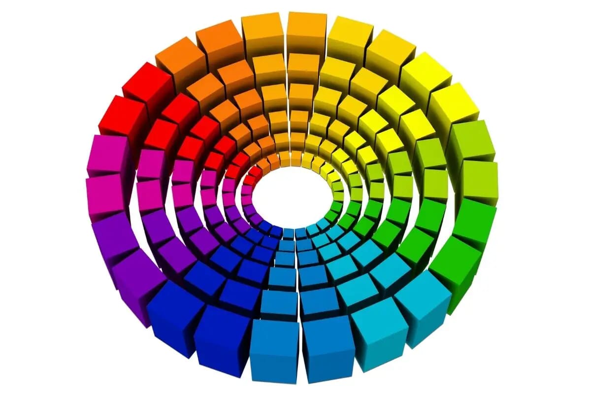
The Color Wheel
To understand tetradic colors and other forms of color harmonies, you will need to know what the color wheel is.

The color wheel, also known as the color circle, is a diagram used to better establish the relationships between various colors. It shows how various colors blend and merge while others clash and conflict.
The main colors on the wheel are the primary colors (red, blue, and yellow) and the secondary colors (green, orange, and purple). Of course, the shades that are in between these colors are also included.
Artists use the color wheel to mix paints, allowing them to achieve the shades that they desire. Various color wheels have been developed across history.
For instance, the influential physicist Sir Isaac Newton created a color circle. This circle was presented to the public in Newton’s 1704 book Opticks. This has become known as the Newton Disc.
However, more modern models have moved away from Newton’s concept, finding it rather limited and outdated.
Some of these wheels are more complex than others. If you have a limited understanding of color wheels, you may want to stick to a more basic color wheel.
What is Tetradic Color?
Tetradic color is another technique used to find the perfect color harmony. This method uses the color wheel to identify the best colors to work with.
It can help you determine which colors go well together. When using this method, four colors are chosen from the color wheel.
To begin, you will need to choose a color. This should be one of your favorite colors. For example, you might begin with medium blue.
RELATED: Indicolite (Blue Tourmaline): Properties, Meanings and Uses
Next, you should draw a straight line vertically to this color on the wheel. In this case, this will bring you to a purplish red that is akin to burgundy. These can be considered complementary colors.
To get the next two colors, you will need to draw a horizontal line from the original color to another shade. In the previous example of medium blue, this will land on yellowish-green.
Then, you should draw yet another vertical line to obtain the final color. This will create a rectangle on your wheel.
Consequently, it is comparable to the square color method. In our example, you should end up with a shade of orange-red.
Essentially, this scheme works by giving two pairs of complementary colors. It works by finding colors that are opposite each other on the wheel.
These four colors should work together. This is because they both contrast and complement each other.
However, you should consider that this is a bold quartet of colors to pair together. You should avoid this method if you prefer milder and less eye-catching combos.
After all, it may be hard to get all 4 colors into your outfit or home decor.
Examples of Tetradic Color
Hopefully, the above instructions will enable you to use this method by yourself.
Luckily, if you are struggling with the method, we have included some more examples for your convenience.
Consider combining some of the following colors if you want to achieve an attention-grabbing aesthetic:
- Blue, green, orange, and red.
- Blue, yellow, orange, and purple.
- Reddish-purple, blueish-purple, yellowish-green, and yellowish-orange.
If you are struggling to use this technique, one way that you can achieve a similar effect is to find two sets of colors that are opposite one another on the wheel.
Fundamentally, this is what tetradic colors are all about.
When To Use Tetradic Color?
Now that you understand what tetradic colors are and know some examples of them, you must also know when to utilize them.
After all, it may seem a bit odd that you would need 4 colors that complement each other. You might be surprised to learn that this theory can be used in a few situations, such as:
Tetradic Color In Fashion
You may want to have 4 colors that go together in fashion. You could use one color for your top, another for your trousers, a third for a jacket, and a final for any accessories you wear.
Tetradic Color In Branding
If you are trying to create a business, you will need to choose a logo that represents your business.
The best way to do this is through eye-catching and memorable colors. Therefore, you may want to use 4 complimentary colors when creating a logo.
Tetradic Color For Design
Are you a graphic designer? If so, understanding what colors work together will be extremely useful.
Tetradic Color In Art
If you consider yourself an artist, you may need an understanding of triadic color schemes. These colors can breathe life and enthusiasm into your art, allowing it to jump off the page, canvas, or screen.
Frequently Asked Questions
Get your last-minute queries answered here before you leave us today!
What Are Color Schemes?
Color schemes are a popular way to change the look of a room. They allow you to make changes to the overall appearance of a space without having to spend too much money.
A color scheme is simply a set of colors that you decide to combine. The most common types of color schemes are based on colors that complement one another.
Some great color schemes for decor include yellow and gray, red and white, blue and brown, turquoise and gray, plus light blue and bubblegum pink.
What Are Primary Colors?
Primary colors are those that cannot be created from any combination of secondary colors. There are three primary colors: red, yellow, and blue. Other colors are mixed from these three colors.
You can make pretty much any color by combining them. For example, you can create green by mixing blue with yellow. Theoretically, red, blue, and yellow can also be added in equal parts to make white.
Primary colors are essential to the color wheel. A very basic model of the color wheel will feature the 3 primary colors and the 3 secondary ones (green, orange, and purple).
Why Are Tetradic Colors Considered Important?
The reason why tetradic colors are considered important is that they are complementary colors.
Complementary colors are colors that are always opposite each other on the color wheel.
Many people use this technique in graphic design and home design. Some people even use it in fashion.
Final Thoughts
In conclusion, you now know how to use the color wheel effectively. The color wheel is a great tool when it comes to mixing paint.
However, you should only use it to select complementary colors. Otherwise, you risk making something that looks dull or unappealing.
The tetradic color scheme is a brilliant method for achieving this look. You should contemplate whether you prefer analogous or contrasting colors.
If you prefer analogous colors that share similar tones, this may not be the method best-suited to your needs. Meanwhile, if you like string colors that are rich in contrast, try using this technique.

He strives to share his knowledge through writing contributing to science news, research articles, and fiction. He has experience organizing exhibitions, publishing articles, and presenting at conferences. He aims to blend his academic and business knowledge to enhance his work and productivity.
His curiosity for cultural diversity and exploring science, art, and spirituality led him here to spread his knowledge with other individuals. Dejan has written about various topics, such as the impact of globalization on culture, the role of storytelling in human evolution, and the connection between art and spirituality.
- Affirmations - January 26, 2023
- 22 Most Popular Viking Symbols (Norse Mythology) - August 3, 2022
- Vegvisir Symbol (Norse Mythology And Modern Times) - July 29, 2022
Related posts:
 The Personality Of Those With The Favorite Color Green
 All You Need To Know About The Personality Of People With The Favorite Color Purple
 A Spoonful Of Color – 8 Heavenly Colors For Therapy
 The Powerful Meanings of The Color Pink
 The Fantastic Meanings Of The Color Fuchsia
 The Magical Meanings Of The Color Magenta
 The Interesting Color Yellow And It’s Meaning
 The Power Of Color Magic (With Images)
whoah this weblog is magnificent i love reading your posts. Stay up the great work! You understand, a lot of individuals are searching around for this information, you could help them greatly.
After study several of the web sites on your own internet site now, and I really appreciate your technique of blogging. I bookmarked it to my bookmark internet site list and will be checking back soon.
Hello! I want to say that this article is awesome, nice written and include approximately all vital infos. I would like to look extra posts like this.
My spouse and I stumbled over here from a different website and thought I may as well check things out. I like what I see so now i’m following you. Look forward to going over your web page repeatedly.